CSS Style Guide
CSS Style Guide
Contents
The Baseline
Rather than use arbitrary amounts in pixels, the line-height spacing (or ‘leading’) is used to govern all the spacing in the Resolve to Save Lives site.
This baseline is the padding inside containers, spacing in between elements and column/row gaps in Grids and Flexboxes. It’s set as a CSS variable, var(--baseline), and can be used in Elementor by selecting the custom value (pencil icon) in fields.
Values are in rem‘s to be harmonious with the text size. The only exception is with line-height itself, which is always written ‘unitless’ to make it proportional to the text size.
There are then sizes based off this to give smaller or larger sizes:
--baseline |
Baseline | 1.6rem |
--baseline-x2 |
Double Baseline | 3.2rem |
--baseline-x3 |
Triple Baseline | 4.8rem |
--baseline--1 |
Negative Baseline (-1) | -1.6rem |
--baseline-half or --grid |
Half Baseline | 0.8rem |
Negative Baseline can be useful in layouts to close up gaps, such as a specific element in a grid layout that you want to ignore the grid gap for a specific element.
Typescales
The typescale is the amount at which type is sized up or down from the base size (16px/1rem), and there are two scales used on the site.
- For viewport widths up to 767px the scale is
1.250. This means that a heading 3 is 1.25x the base font size, heading 2 is 1.25 x 1.25x and so on. - For viewport widths 768px or larger, it becomes
1.141.
This means that type sizes have a hierarchical relationship, and reduces the amount of scaling for mobile.
Typography
<p> |
Body text is set to use the browser default (16px) at 1rem. Headings are then sized up from that using the type scale. |
Body Text |
<h1> |
Heading One |
Red eyebrow is added automatically |
<h1 class="longform"> |
Heading One |
Longform Heading One - for when longer titles are needed, and all caps would be harder to read. |
<h2> |
Heading Two |
Red eyebrow is added automatically |
<h3> or .intro |
Heading Three |
|
<h4> |
Heading Four |
Same size as Body Text |
<h5> or .subtext |
Heading Five |
Used for content such as job titles |
|
|
Hanging quote marks are added automatically around the <p> tag. Using <strong> styles the persons name within <cite>. |
|
|
Adding the class fr uses guillemets instead of latin quotes. |
|
|
Quotation marks can hidden by adding a class of noquotes to either the blockquote or parent widget in Elementor. Useful for highlighting text that isn't a direct quote. |
<ul class="checklist"> |
|
Adding a class of checklist to a unordered list shows tick icons instead of bullets. |
Links
There are four levels of links, and their styling changes slightly depending on context. In all cases, the color var(--rtsl-light-purple-1) is used as a visual cue.
1. Inline Links
The simplest of these are inline links which appear within the body of text. These should always describe where the link goes (no ‘read more’ or ‘click here’), underlined for usability, and never set to open in a new tab.
2. ‘More’ Links
Sometimes, a link will be a complete sentence on it’s own line, such as in a list of ‘Further Reading’. As an underline is potentially too visually noisy here, applying a class of more-link to the widget block will style all links without the underline. A chevron arrow with a hover transition is added at the end to help signify that it’s a link:
3. Download Links
If a link is to a download (instead of a webpage), such as a PDF, applying a class of download to either the widget block containing the link, or directly to the link tag, will style the link with a download arrow. Where possible, add the file format and size in brackets. If you italicise this information it will automatically be formatted like this:
<a class="download" href="#" rel="noopener" download="">One Page Factsheet <em>(PDF 142k)</em></a> 4. Card Links
When an entire card or banner is a link, applying a class of card to link tag will style it as a white rounded card with the onward arrow and hover transitions, This also works on Elementor Containers, if the HTML tag is set to ‘A (Link)’ under Layout > Additional Options.

Layout
Resolve to Save Lives uses an 11 column CSS grid when the browser window is 999px or more wide.
The outer columns (1 & 11) are flexible margins that constrain the width of the layout once it’s wider than the maximum width (82rem). By including this area in the grid, we can specify content to align with the edges (such as full width sections with a different background colour).
While you do not have to use the classes, (use a container set to ‘boxed’ with 9 equal columns grid layout), Elementor’s UI does not provide access to all of CSS Grid’s capabilities (such as column spanning, or specifying the same row to overlay elements). By using classes, we can create layouts quickly that are consistent across the site, using the minimal amount of containers. Not everything can be done with classes however, some page elements will require custom styling that won’t apply anywhere else.
To start, select the main container in Elementor:
- In Layout > change Content Width to ‘full-width‘ instead of ‘boxed’
(Leave the layout method as Flex) - Under Advanced > CSS Classes, add the class
main-grid - Then to lay out elements inside the container, add the relevant class, using this formula:
col-[start column]-[number of columns to span]. So if we applied the classcol-2-3, the element would start on column 2 and span 3 columns. - If you don’t specify a column, it will automatically use
col-4-4(off centre column suitable for text).
For screen sizes 998px wide or smaller, the columns are centred and set to a max-width of 35rem, with the exception of image widget blocks, which are full-width.
Example Grid configurations:
col-1-11
col-2-9
col-2-3
col-4-5
col-9-2
col-2-3
col-5-3
col-8-3
col-1-1
col-2-1
col-3-1
col-4-1
col-5-1
col-6-1
col-7-1
col-8-1
col-9-1
col-10-1
col-11-1
col-2-2
col-5-6
col-4-2
col-6-7
col-1-7
col-1-7
Layout Patterns
These layout patterns can be copied and pasted to other pages within the Elementor UI.
Heros
Standard layout pattern for Headers with Hero images. Both the image and the container for the text have a class of row-1, so that they appear on the same row, overlapping.
CSS Style Guide
Main Heading level one

Heading, body text and sidebar
A common layout pattern for pages, where the heading is placed to the side.
How we work
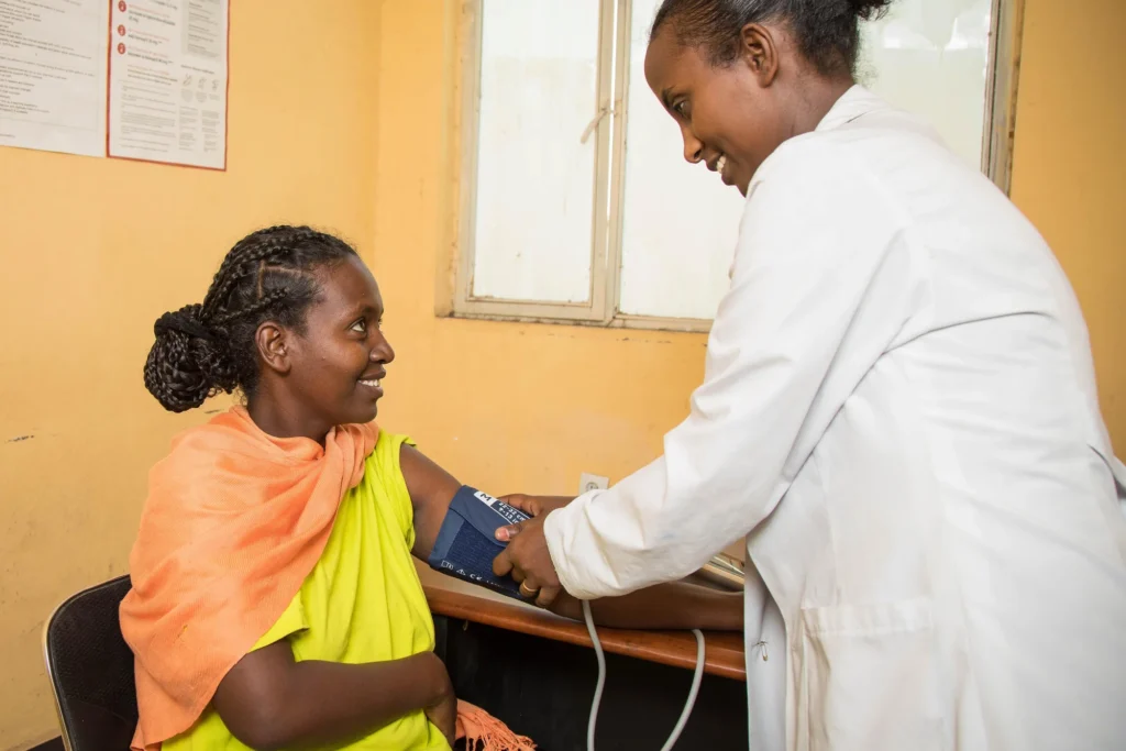
To support the Government of India’s mission to reduce high blood pressure by 25% and save lives by achieving United Nations Sustainable Development Goal 3.4, RTSL launched the award-winning India Hypertension Control Initiative (IHCI) in 2017 in collaboration with the Ministry of Health and Family Welfare, state governments, the Indian Council of Medical Research, and the World Health Organization (WHO). In just a few short years, IHCI grew to provide quality care to millions of patients with high blood pressure or diabetes. With IHCI now successfully integrated into India’s national health program (NP-NCD), we continue to work with the Government and partners to strengthen primary health care and further reduce the burden of non-communicable diseases.
Zig-zag image & text
This pattern flows blocks of images & text from side side in a zig-zag, to create a more interesting layout.
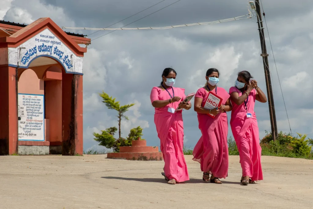
We work with global and local partners to develop cardiovascular disease prevention programs based on current evidence-based practices that address the needs of the population and the health system. Our global partners include the World Health Organization, John’s Hopkins University, the Global Health Advocacy Incubator, the U.S. Centers for Disease Control and Prevention and the Pan American Health Organization.
Animations
Simple, subtle animations can be added to elements using the following classes:
| Base class | + Animation name | + Duration* | + Delay** |
|---|---|---|---|
animate |
poppulseslide-leftslide-rightslide-upfade-inrotate-leftrotate-right
dash |
duration-60sduration-30sduration-20sduration-10sduration-5s
*By default, animations are set to last .5 seconds |
delay-1delay-2delay-3delay-4delay-5delay-6delay-7delay-8delay-9delay-1s
**By default, animations have no delay. |
So, if you wanted an element to fade in over 5 seconds, but delay it’s start by .2 seconds, you would add the following classes:
animate fade-in duration-5s delay-2
If a user has the prefers reduced motion setting on, the animation is set not to load, and the opacity of the element is set to 1 to ensure it’s visible.
animate appears within the top 75% of the window, and adds a class of start to trigger the animation. The class isn’t removed until refresh, so that the animation only plays once.
Example with ‘pop’ animation and delay on each item: 


